
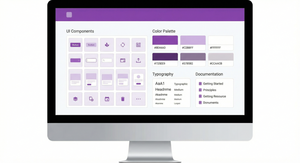
A design system without documentation is just a collection of files no one agrees on how to use. A living style guide transforms those files into a shared language your designers, engineers, and content writers can work from every day. This guide covers what design system documentation needs to include, which tools support it in 2026, and how to keep it current as your product evolves.
What Is a Living Style Guide?
A living style guide is design system documentation that stays synchronized with the codebase and design files rather than going stale between update cycles. It shows working components alongside their usage rules, accessibility requirements, and implementation notes.
Living Style Guide vs. Static Style Guide
A static style guide is a document created at a point in time and saved as a PDF, a Figma file, or a wiki page. It describes how things should look but does not automatically reflect how they actually look in the product today. Every time a component changes, someone has to manually update the documentation. Most teams never do.
A living style guide connects documentation to source. When a developer updates a button component, the documentation reflects that change automatically, or at minimum requires a single commit to stay current. This keeps design intent and production reality from drifting apart.
Why Product Teams in 2026 Need Living Documentation
Modern product teams ship fast. A component library that updates every two weeks cannot rely on documentation maintained quarterly. Static documentation creates gaps, contradictions, and debates about which version is correct. Those debates slow teams down and erode trust in the system itself.
Teams that invest in living documentation report fewer design inconsistencies, faster onboarding, and fewer handoff misunderstandings between design and engineering.
Core Components Every Design System Document Needs
Strong design system documentation does more than catalog UI components. It communicates the reasoning behind decisions so teams make consistent choices even when the documentation does not explicitly cover a situation.
Design Tokens: The Atomic Layer
Design tokens are the named values that define your visual language: color, typography, spacing, border radius, elevation, and animation timing. Document every token with its name, value, and usage context. Distinguish semantic tokens from base tokens. A semantic token like color.text.primary communicates intent. A base token like color.blue.500 communicates only the raw value.
Show each token name alongside a visual preview. Include do and do-not use cases, and explain how semantic tokens behave in dark mode if your system supports theme switching.
Component Library With Usage Guidelines
Each component needs more than a visual preview. Document its purpose in one sentence, its variants, its interactive states (default, hover, focus, disabled, error), its accessibility requirements, and the contexts where it should not be used.
A component page without “when to use” and “when not to use” sections leaves too much interpretation to the person implementing it. That is where inconsistency starts.
Writing and Voice Guidelines
Design system documentation often stops at visual components and ignores the words inside them. This leaves different writers and product managers making independent decisions about button labels, error messages, empty states, and onboarding copy. The result is a product that feels inconsistent even when the visual design is perfectly implemented.
Include a section covering your brand voice, UI copy conventions, preferred terminology for common actions, and rules for capitalization and tone across product contexts.
How To Build Design System Documentation Step by Step
Step 1: Audit Your Existing UI Patterns
Before writing a single documentation page, audit what you have. Screenshot every distinct UI pattern and group them by component type. Count how many variations exist and identify which are intentional versus accidental inconsistencies.
This audit gives you a full inventory and a clear picture of the debt your design system needs to resolve. Start with your highest-frequency components: buttons, inputs, navigation, typography, and cards cover the majority of most products.
Step 2: Choose a Platform and Structure It Well
The best platform is the one your team will actually use. If your engineers already live in GitHub and Storybook, a Storybook-based docs site makes contribution frictionless. If your team includes non-technical contributors, a tool like Zeroheight or Notion lowers the barrier to keeping content current.
Regardless of platform, organize documentation by component type and user task, not by the team that created it. A page titled “Forms” is more useful than “Engineering Components.” Structure navigation so a new designer or engineer finds what they need within two clicks.
Design System Documentation Tools Compared
| Tool | Best For | Figma Integration | Code Integration | Free Plan | Learning Curve |
|---|---|---|---|---|---|
| Storybook | Engineering-led teams | Plugin (limited) | Native (React, Vue, etc.) | Yes (open source) | Medium |
| Zeroheight | Design-engineering bridge | Deep (Figma, Sketch) | Storybook embed | Free tier (limited) | Low |
| Supernova | Token-first teams | Deep (Figma) | Token export to code | Free tier | Medium |
| Notion | Cross-functional teams | Embed only | None (manual) | Yes | Low |
| GitBook | Developer-focused docs | None native | Git-based sync | Yes | Low |
| Confluence | Enterprise teams | Plugin available | None (manual) | No (paid) | Medium |
How To Keep Design System Documentation Alive
Establish a Contribution Model
Decide who owns documentation, who can contribute, and what the review process looks like. In smaller teams, a single design systems lead often owns it. In larger organizations, an open source-style model works well: anyone proposes changes, but a core team reviews and approves them before they merge.
Write the contribution process down and include it in the documentation itself. Teams that can see how to suggest a change are more likely to follow through.
Version Control and Changelogs
Track every change to your design system with a public changelog. Document what changed, why it changed, and how teams should update their implementations. Version your documentation alongside your component library so teams know which version their product runs on.
Avoid These Design System Documentation Mistakes
Building Documentation for Designers Only
Treat your documentation as a product with multiple audiences. Write component pages useful to a developer, a product designer, a QA tester, and a content writer at once. Each audience needs different information, and good documentation serves all of them.
Letting Documentation Drift From the Codebase
Make documentation updates part of your definition of done for every component change. Link documentation updates to the same pull request that changes the component. This keeps the two in sync without a separate documentation sprint each quarter.
Build Documentation That Works As Hard As Your Design System
A living style guide is not a project you finish. It is a practice you maintain. Start with what you have, document your highest-frequency components first, choose a platform your whole team will use, and build contribution in from day one.
Frequently Asked Questions
What is design system documentation?
Design system documentation is the written record of your product’s UI components, design tokens, usage guidelines, and content standards. Strong documentation turns a component library into a shared language for the whole product team.
What is the difference between a design system and a style guide?
A style guide is the documentation layer of a design system. The design system includes the actual components, design tokens, and code that make up the UI. The style guide documents how to use all of that.
What tools do product teams use for design system documentation?
The most widely used tools in 2026 are Storybook for engineering-led teams, Zeroheight for bridging design and development, Supernova for token-heavy systems, and Notion or Confluence for cross-functional teams.
How often should you update design system documentation?
Update documentation every time a component or token changes. Make documentation updates part of the definition of done for any system change.
What are design tokens in a design system?
Design tokens are named variables that store your visual design decisions: colors, font sizes, spacing values, border radii, and animation timing. When you change a token, the change propagates to every component that references it.
How do you get engineers to use the design system documentation?
Make the documentation useful to engineers, not just designers. Include code examples, component API references, and semantic token names alongside visual specs. Host the documentation somewhere engineers already work.
What should a component documentation page include?
A component page should cover the component’s purpose, visual variants, interactive states, accessibility requirements, content constraints, and do and do-not use cases. Include a live preview and code examples.