The difference between an app that feels polished and one that feels flat often comes down to details users cannot name but always notice. Micro-interactions are those details: the subtle animation when you like a post, the haptic tap when a toggle switches, the progress ring that keeps you from abandoning a slow upload. This guide explains what micro-interactions are, why they matter, and how to design them well.
What Are Micro-Interactions?
A micro-interaction is a contained product moment that performs a single task. It communicates status, guides a step, prevents errors, or confirms an action. Every digital product contains dozens of them whether the design team planned them or not.
The Four Parts of a Micro-Interaction
Designer Dan Saffer’s framework breaks every micro-interaction into four components. The trigger initiates the interaction through user action or a system event. The rules define what happens after the trigger fires. The feedback is what the user sees, hears, or feels. The loops and modes determine how long it lasts and whether it changes after repeated use.
Micro-Interactions vs. Animations
Not every animation is a micro-interaction. An onboarding illustration that plays once on first launch is an animation. A button that changes color when you press it is a micro-interaction. The distinction is function. Micro-interactions serve a specific communicative purpose tied to user action or system state.
Why Micro-Interactions Matter in UX Design
How They Build Trust Through Feedback
Users need to know their actions worked. When someone taps a submit button and nothing visually changes, they tap it again. A loading state, a button color change, or a brief success animation tells the user the system received their input. A micro-interaction showing progress during a one-second delay reduces perceived wait time and prevents abandonment.
The Emotional Impact of Tiny Details
Micro-interactions shape emotional response at a subconscious level. The satisfying snap of a completed task, the playful bounce of a heart icon on double-tap, the gentle shake of a form field on invalid input — all of them shape how users feel while using the product.
The Most Effective Types of Micro-Interactions
Feedback and Confirmation States
A button that briefly depresses on tap, a form field that turns green after valid input, a checkmark that animates in after a successful save — these confirmation states answer the user’s question “did that work?” before they have to ask.
Progress and Loading Indicators
Progress micro-interactions manage expectations during waits. A progress bar shows how far along a process is. A skeleton screen shows where content will appear before it loads. Skeleton screens outperform blank loading states in perceived performance — users rate content as loading faster with a skeleton screen even when actual load time is identical.
Input and Error States
Inline validation that confirms a correctly formatted email reduces abandonment. A field that gently shakes on invalid input is more effective than a static error message that appears only after submission fails. Validate on blur (when the user leaves a field), not on every keystroke.
Micro-Interaction Design and Prototyping Tools Compared
| Tool | Type | Best For | Code Output | Learning Curve | Free to Use |
|---|---|---|---|---|---|
| Framer | Design and prototype | High-fidelity interactive prototypes | Yes (React) | Medium | Free tier |
| ProtoPie | Prototype | Complex interaction logic without code | No | Low | Free tier |
| Principle | Prototype (macOS) | Quick timeline-based motion prototypes | No | Low | Trial only |
| Framer Motion | Code library (React) | Production micro-interactions in React | Yes (native) | Medium | Yes (open source) |
| Lottie (Airbnb) | Animation playback | Complex vector animations from After Effects | JSON export | Low | Yes (open source) |
| CSS Transitions | Code (native) | Simple state transitions in any web project | Yes (native) | Low | Yes |
How To Design Effective Micro-Interactions
Start With User Intent, Not Animation
Before adding motion, identify the specific question the micro-interaction needs to answer. Did my action register? Is something loading? Did I make an error? Every micro-interaction should answer exactly one question clearly and immediately. If you cannot state the communicative purpose in one sentence, remove it.
Timing, Easing, and Duration
Most UI micro-interactions should run between 100 and 300 milliseconds. Under 100ms feels instantaneous and misses the communicative window. Over 300ms feels slow and makes the product seem unresponsive. Ease-out suits elements entering the screen. Ease-in suits elements leaving. Replace linear easing deliberately rather than accepting the default.
Common Micro-Interaction Design Mistakes
Over-Animating and Adding Friction
Every animation has a duration cost. When users must watch an animation complete before they can act, the interaction blocks their flow. If a micro-interaction is not communicating something specific and useful, cut it.
Ignoring the Reduced Motion Preference
Users with vestibular disorders or motion sensitivity can enable the prefers-reduced-motion setting in their OS. Every web micro-interaction should include a prefers-reduced-motion alternative — the end state without the transition, so functionality stays intact.
Design the Details That Users Remember
Keep durations short, easing natural, and purpose singular. Respect the reduced motion preference. Remove anything that slows users down without communicating something useful. The details that survive that filter are the ones users remember without knowing why.
Frequently Asked Questions
What is a micro-interaction in UX design?
A micro-interaction is a contained design moment that performs a single communicative task: confirming an action, showing progress, or signaling an error.
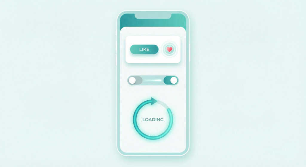
What are examples of micro-interactions in apps?
Common examples include the heart animation when you like a post on Instagram, haptic feedback when a toggle switches on iOS, skeleton screens while content loads, and inline form validation turning a field green after valid input.
How long should micro-interactions last?
Most micro-interactions should last between 100 and 300 milliseconds. Interactions tied directly to user input should stay as short as possible while remaining perceptible.
What tools do designers use for micro-interaction prototyping?
The most widely used tools are Framer and ProtoPie for high-fidelity prototypes, Principle for quick timeline-based motion on macOS, and Framer Motion or CSS transitions for production web implementation.
How do micro-interactions affect conversion rates?
Well-designed micro-interactions reduce form abandonment through inline validation and reduce support contacts by clearly communicating system state during errors. Their impact is cumulative.
How do you make micro-interactions accessible?
Implement the prefers-reduced-motion CSS media query to serve non-animated alternatives. Never convey information through motion alone — any status change must also appear as text or a screen reader announcement.